
When I first started Frost + Sun, I had no idea how to use Pinterest. I just figured that it might bring a few clicks to my blog.
I started my account like everyone else: no pins, no followers, and no engagement.
It took a good 6 months to a year before one of my pins went viral and started bringing in a steady stream of traffic to my site.
All it took was one viral pin for me to realize how powerful Pinterest marketing can be for bloggers and small businesses.
From that moment on, I’ve studied what made people click on some pins and not others so that I could replicate that experience and build traffic to my blog.
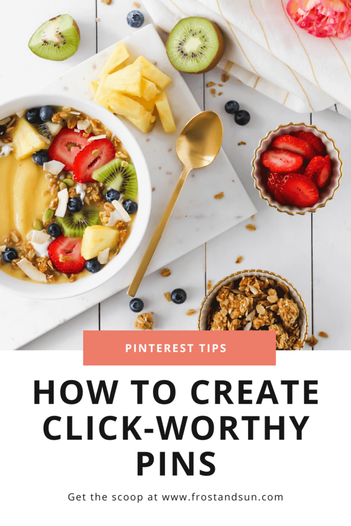
In this post I break down the most important tips I’ve learned about how to make Pinterest pins that pop so that you can create click-worthy pins that bring you lots of traffic, too.
Start with a vertical image
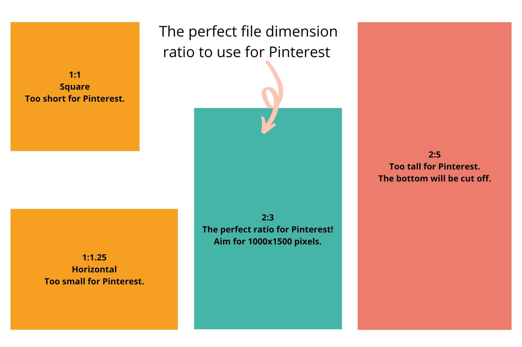

First things first, start off with a 2:3 ratio for your file dimensions.
Pinterest recommends 1000×1500 pixels as the optimal size for pins.
A larger file dimension will ensure your image displays well on larger screens – especially screens with retina displays.
A few years ago, a popular Pinterest image size were vertical pins that were super long (at least 2:5).
The idea was that longer pins took up a lot of space in Pinterest’s feed, therefore it stood out and kept peoples’ eyes on it longer.
However, this strategy no longer works.
Pinterest truncates pins that are abnormally long, which means they could be cutting off important information.
In short: don’t do this.
Lastly, avoid square and horizontal pins as they will just get lost in the sea of vertical pins.
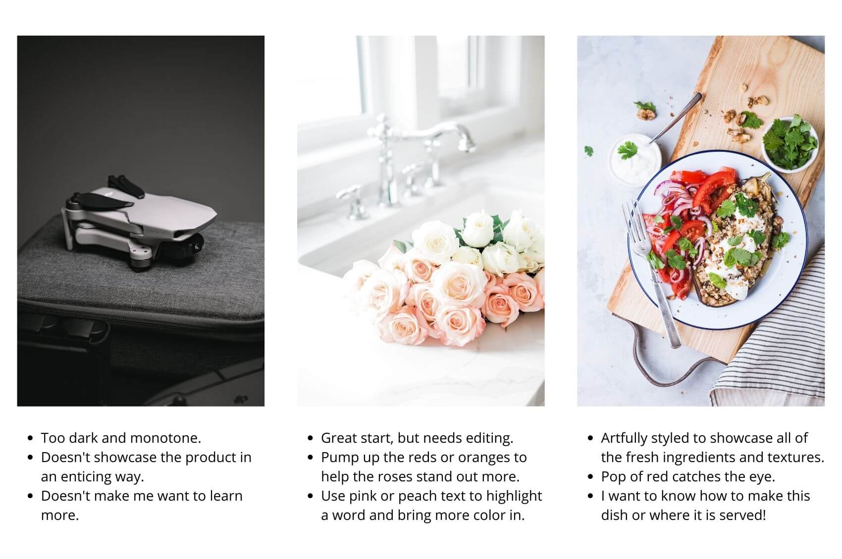
Use visually striking photos or graphic elements
Pins are basically advertisements for your blog post, product, or website.
Therefore you want to use photos or graphic elements that are visually striking, intriguing, or interesting in some way.
A quick and easy way to make sure you are selecting perfect images for Pinterest is to ask yourself: Does this photo make me want to know more?.
If yes, it’s a keeper.
If no, find another image or determine if it can be salvaged through editing or additional elements in the overall pin design.
Over time it will become easier to identify pinnable images, especially ones that your intended audience will love.
The perfect Pinterest image, according to Curalate

There are a few data-proven tips to keep in mind when selecting Pinterest photos or graphic images.
According to a study by Curalate that was featured in Wired, Pinterest images with faces in them got less engagement than pins that didn’t have faces (source).
I found this point to be true for my pins, as all of my best performing pins all have no faces in them.
That said, I’ve definitely seen pins with faces do well for other Pinterest creators.
Curalate’s study also found that dark images were repinned at far lower rates than brighter, more colorful images.
I’m not surprised about this point, as it can be hard for the visual impact to come across in dark images.
Lastly, Curalate’s study determined that photos with warm colors, like red, orange, or pink, do better than cool colors, like blue.
I think this finding is a bit misleading, as many other elements can make or break a photo.
For example, some of my best performing pins include photos with a turquoise ocean or sapphire blue sky as the main focus.
Although Curalate’s findings are backed by scientific data, their tips aren’t hard and fast rules that you have to follow to a T.
They are meant to help guide you in selecting photographs or graphic elements that can help give your pin the highest possibility to do well.
If you stick to the main rule that images or graphic elements are visually striking and inviting, you’ve already laid down a great foundation for creating a pinnable image.
TIP: If you don’t have enough photos of your own to make pins, use stock images. I use HauteStock, Styled Stock Society, and Canva when I am in need of photos for Pinterest.
Add click-worthy titles that are easy to read
Text overlays on pins is a common area where pin designs fail, so take notes!
When it comes to the text overlay, make sure your font size is large enough to read on a mobile device.
I can’t tell you how many times I’ve seen what could have been a good pin but it falls flat because the text is barely legible due to its small size.
Next, use a serif or sans-serif font that is easy to read.
Script fonts can be hard to read, especially on mobile devices, so I try to stay away from them.
However, from time to time I use a script font that is easy to read to emphasize a word or 2 in the title.
You should also be careful with colored text against a colored background – including text added directly over photos.
Either of these situations can cause poor contrast and make the text hard to read. Plus the text won’t stand out as much.
It is also difficult for people with visual impairments to read text if there isn’t sufficient contrast.
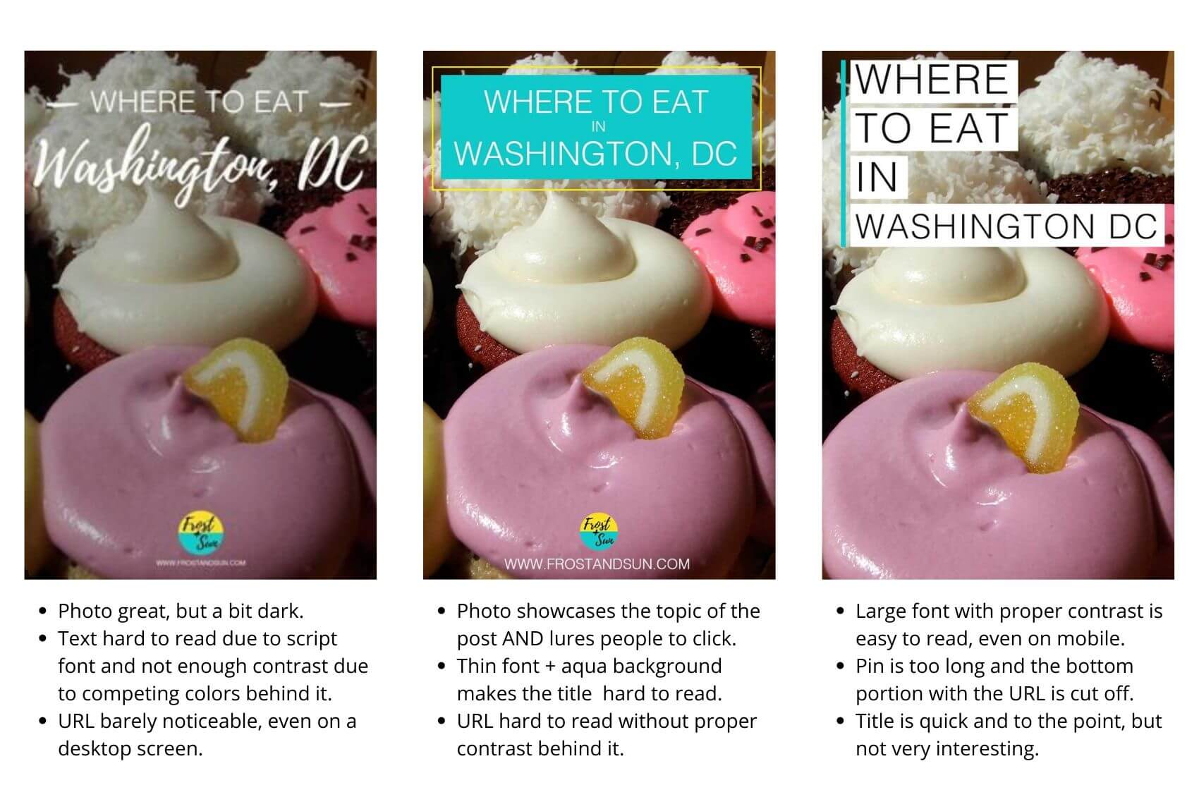

Lastly, Pinterest suggests that text overlays shouldn’t cover more than 30% of the pin so that photos or artwork can shine.
On the flip side, I’ve seen plenty of pins with text from top to bottom that perform quite well.
Play around with size and placement to see what works best for you.
As boring as it sounds, I recommend using a white background with black text as a foolproof way to avoid poor contrast.
This will also go a long way in ensuring good visibility, especially on mobile devices.
That said, if you prefer to incorporate color into your title, use the WebAIM Contrast Checker to ensure you’re using high contrast color combinations.
Tips for writing catchy Pinterest titles
Last up, make sure your pin title is descriptive and entices people to click on it.
At the same time, don’t get so click-baity that the title doesn’t truly reflect what your post is about.
Incorporating power words, such as viral, gorgeous, or little-known, are a quick and easy way to pump up basic titles.
Power words are meant to evoke some kind of emotion, which is what can make a basic title become click-worthy.
Try CoSchedule’s Headline Analyzer to test or revamp your titles.
P.S. This tool also works well for blog post titles!
Use templates to establish brand recognition
Once people become familiar with your brand, they will be more likely to engage with your pins.
You can help create brand recognition with your pins through the use of templates.
Over time, people on Pinterest will start to recognize your pins due to seeing the same graphic elements, such as image layout, fonts, URL, or logo.
TIP: Adding your website URL and/or logo also helps prevent image theft, as well as prove ownership of pin images. Unfortunately there are scammy marketers on Pinterest that steal good pins, upload the images, and direct them to THEIR URLs.
As you continue creating content on Pinterest, you’ll also learn what does and doesn’t work best with your audience.
This will help you tweak your Pinterest template as needed.
Aside from brand recognition, templates can also help you replicate your viral pins by including similar elements in future pins.
Experiment with new pin types
Early adoption of new pin types can help you get ahead because you’ll stand out amongst the billions of pins on Pinterest.
Video pins are a fun way to add an attention-grabbing element to your pins.
You can add short video clips in place of a photo or add animated elements, like bouncing arrows, to help grab users’ attention.
Idea pins are similar to carousels on Instagram, where you swipe or click through a series of slides.
I’ve been testing idea pins recently and see some traction with gaining followers and reaching a wider audience.
So although this pin type won’t help me get traffic to my website, they are helping with brand recognition.
Add a helpful caption
No matter how well designed your pins are, they won’t gain traction on Pinterest without a good caption.
The purpose of a caption is two-fold: to help Pinterest users understand what the content is about and to help Pinterest’s algorithm understand what your pin is about.
Keep your captions short and to the point.
A few sentences is plenty. Include keywords that are relevant to your content to help users (and Pinterest!) understand what the content is about.
Be sure to test different designs, images, and titles with your pins to see what works best with your audience, especially if you are just starting out or have a stagnant account.
Lastly, 85% of Pinterest users access Pinterest on a mobile device, so it is crucial that your pin designs place mobile users at the forefront (source).
Always test your pins on a mobile device to make sure they work well when scaled-down for small screens.
For more blogging or Pinterest tips, check out these posts:
About the author


Meg Frost is a Boston-based travel blogger that helps people embrace technology to make vacation planning and traveling wicked easy, affordable, and fun.
She holds an M.A. in Journalism from Northeastern University and B.S. in Communication & American Studies from University of Miami.
This post was originally published on July 13, 2020. It was last updated on October 16, 2022.